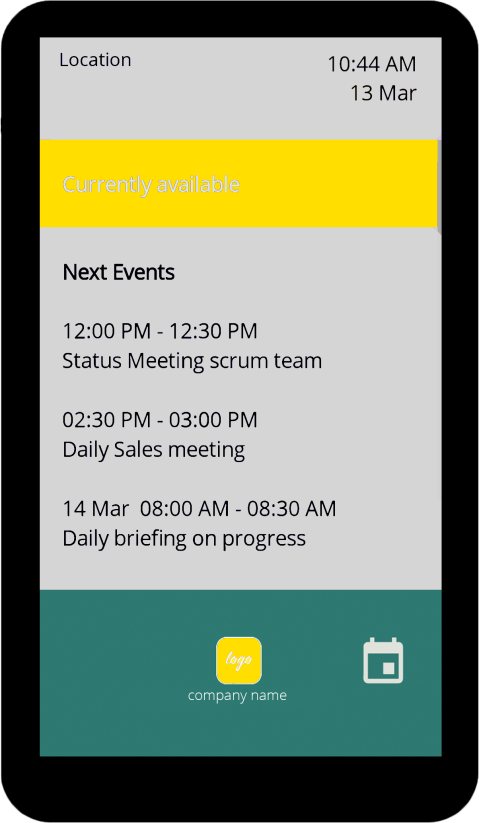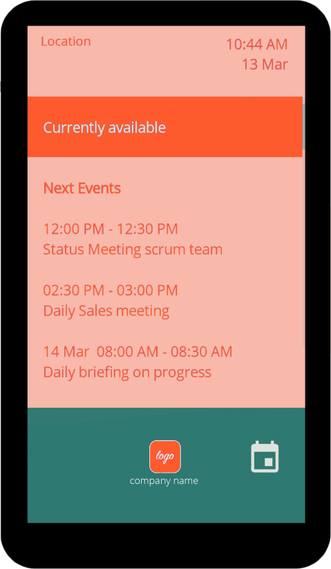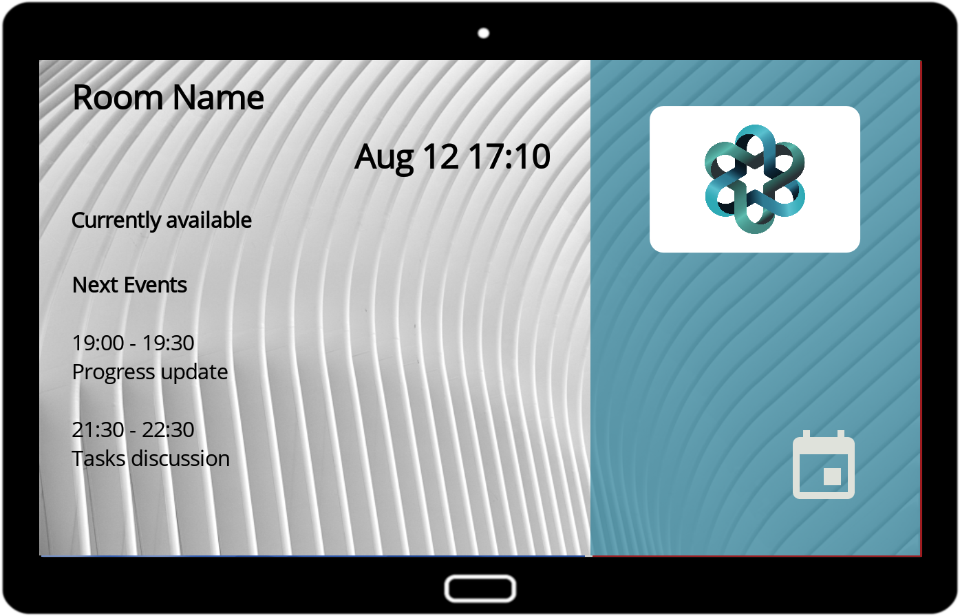
How to create an awesome custom look
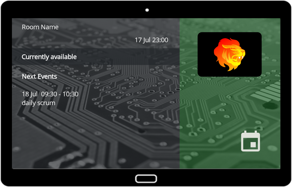
The Quick-and-Dirty way of doing it:
Click here to watch a video.
-
- Go to your website.
-
- Check the colors used.
- Look for good background pictures that you can use (you’re looking for pictures that give bright, almost uniform background to match with dark font colors or vice versa).
- Download your logo by right clicking on it.
-
- Check your tablet resolution by making a screenshot (try pressing volume button and power button at the same time)
- Scale or crop your background image to fit screen resolution
- Transfer your logo file and background picture to the tablet
- Go to “style settings” in the app
-
- Select the image files
- Set your font colors for top header/current events/next events. Stick with colors and style of your website. You can invert bright/dark font colors for the current event area. That’s going to highlight the most important area on your screen.
-
- Check your result. Doesn’t look good? Please continue reading and check our screenshots below…
- Go to your website.
Overview of the process
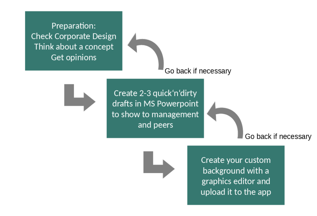
STEP1: Prepare for the concept work
-
-
- Check materials of your corporate image like logo files, layout guidelines, color definition etc.
- Check if you can approach an associated graphics designer – if yes, let them do the job.
- Check the look of your website – which colors are used? Which pictures represent your company best? Probably management will agree to have a similar look.
- Make up your mind about a concept: A plain background with no pictures? Same background on all meeting rooms? Include a company motto? What about the room names? Do they follow a pattern? Maybe it makes sense to give each one its own photo background, e.g. mountains, movies, company sites
- Don‘t forget to ask your boss – he might have his own opinion.
-
STEP2: Get the quick ‘n‘ dirty drafts ready
-
-
- It‘s not wise to do all the work just to find out management doesn’t like it. Provide 2-3 quick samples to let them choose their favorite. Make sure they understand it‘s about the concept, it will look better in the final version.
- Enter your preferred colors in style settings. Enter hex values in the color selector. If you could not find any color code definitions, use a color picker on your logo or website (jump to „how to pick colors“).
- You can use a simple screenshot from MS Powerpoint or utilize tools like MS Paint, GIMP, Adobe Photoshop, Microsoft Office Picture Manager.
- Check the screen resolution of your target device. You can check your tablet resolution if you make a screenshot and look for it’s details.
- You can copy this screenshot to powerpoint (or another tool) to make sure you‘ll have the same ratio in your quick‘n‘dirty concept.
-
Steps to create your preliminary concept (to show to management and peers to make sure they like the result)

Best practices for choosing colors
-
-
- If you don‘t have any better idea, do it like on your website.
- Pick a light color for the „next events“ background (probably for most of the time the biggest area on the screen)
- Pick a dark font color for the „next events“ zone
- For the „current event“ zone, you can invert the colors or choose white fonts on a dark background
- Invert the color choices above if your website theme is dominated by dark colors and light fonts colors.
- Make sure you don‘t have colors that are too close to the colors of the status bar. The default code of red is (#FF9F1D21). If you have red colors in your logo or website theme, consider adapting the red of your status bar.
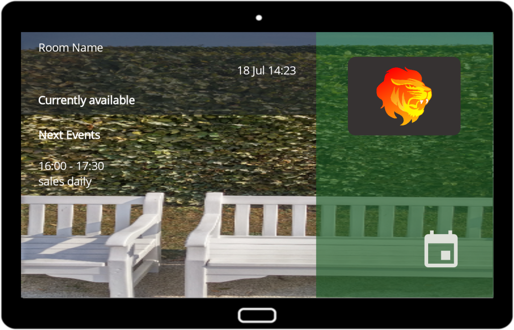
- Avoid using red and green for background picture or background of current and next events. It could be misinterpreted as resource status. (see pictures of bad examples here)
- Make sure you have strong contrasts (dark font color/light background and vice versa) – this applies to background pictures as well (see pictures of bad examples here)
- Unless you’re graphic designer it’s more safe to combine distinct colors. It’s not a good idea to use similar colors – make them equal using the color picker. Stick with your website theme.
-
How to pick fonts and customize font size
-
-
- Font Size: The app has different default font sizes for small, medium and big size screens. Try to keep to default settings, unless you are a graphic designer.
- If you need to, here are some best practices:
- Avoid increasing or decreasing sizing too much.
- Avoid having more than 2 font sizes. For most people, one size for all looks best.
-
Basic layout concepts
-
-
- Plain background with big logo/motto/icon
- Background with narrow banner picture
- Background with full picture
- Background with logo pattern
-
Example 1: Plain background with big logo/motto/icon (landscape and portrait)
-
-
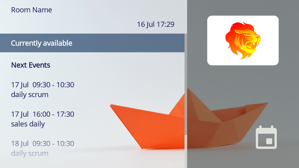
- It’s possible to increase the size of your logo in style settings. If you prefer to use another logo/motto/icon on your background, it needs to be placed inside a background picture. For portrait it should be preferably in the lower half of the screen. For landscape it should be on the right half of the screen. Make sure to avoid ugly overlaps with events.
- Two settings help you to reduce next meetings. You can activate the setting “show only next meetings from today” in admin settings.
It will reduce the number of meetings shown on the bottom part of the main screen. You have even more control with “Number of next events displayed” in style settings. This way you can avoid overlaps.
-
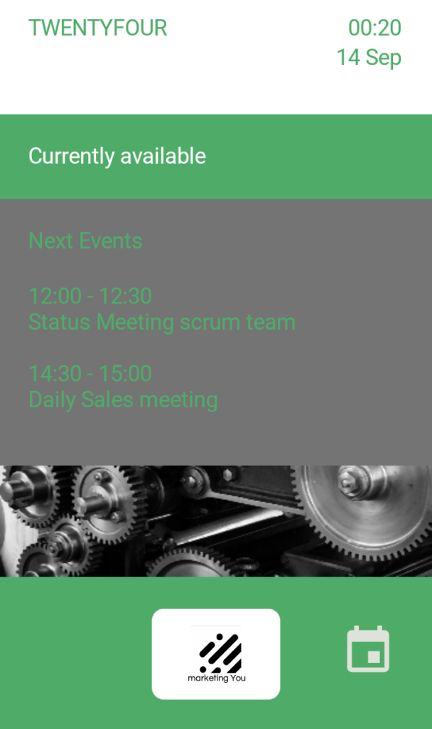
Example 2: Background with narrow banner picture (portrait)
-
-
- This concept has the same overlap issue like the example above.
- It’s a good way to show a picture without giving away the functional, businesslike, down-to-earth design.
- Consider using an individual picture for each room.
- Could look nice with anniversary year banners etc.
-
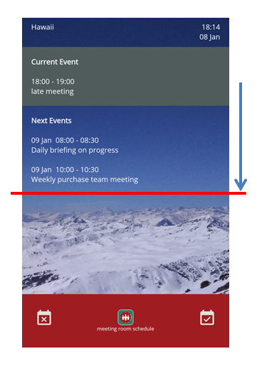
Example 3 – Background with full picture (portrait)
-
-
- This concept has the same overlap issue like the examples above.
- Note that the clear blue sky has a very good contrast with the white font color. Avoid photos with contrasts in itself. Your event data will hardly be readable.
- The overlap issue could be fixed by a setting “Number of next events displayed” in style settings. This way you could define a clearance for the bottom part.
-
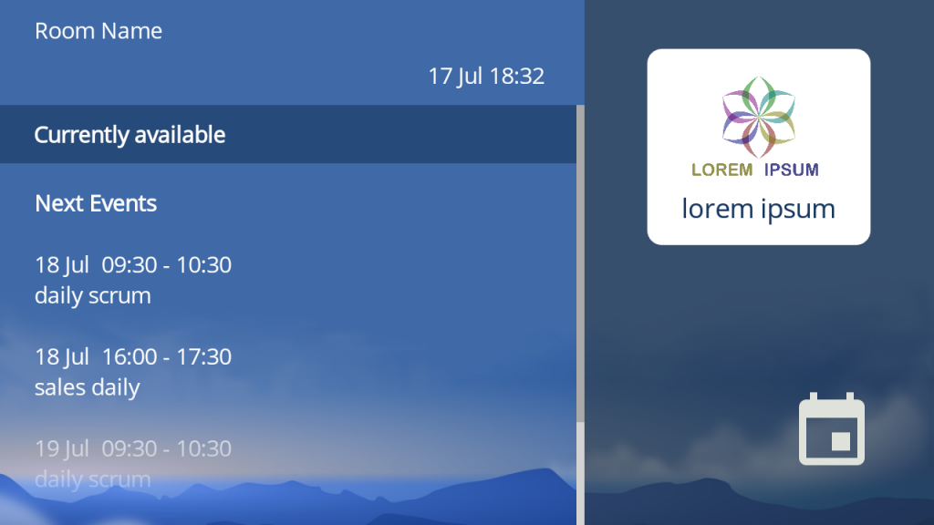
Example 4 – Background with full picture (landscape)
-
-
- This example in landscape orientation uses a picture that has little contrast in itself and a strong contrast to the chosen font colors
- It uses the full background, the loss of readability due to overlapping is reduced to a minimum.
- This effect can be realized by applying transparency and bleaching color effects to the picture (for example using MS Powerpoint, GIMP, Adobe Photoshop)

-
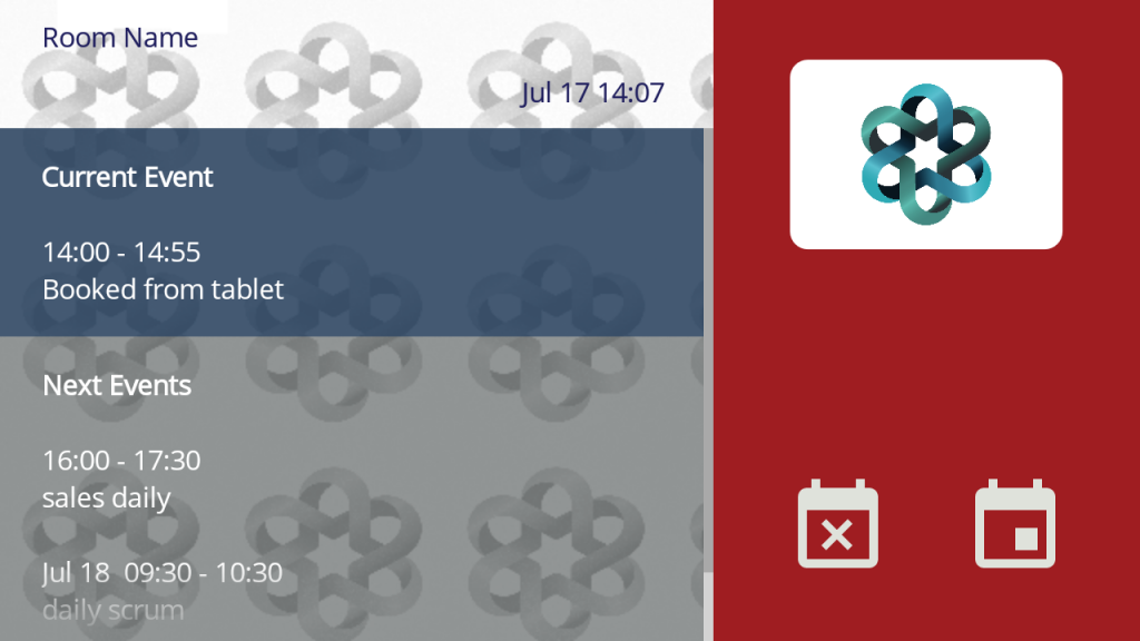
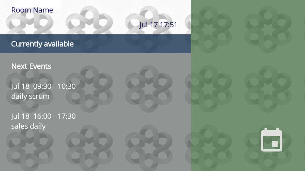
Example 5 – Background with logo pattern (landscape and portrait)
-
-
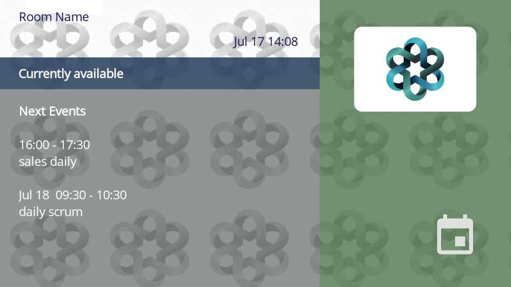
- This example uses a pattern that replicates the company logo. The logo has been bleached to have very low contrast in itself and a strong contrast to the chosen fonts.
- The loss of readability due to overlapping is reduced to a minimum.
- Using transparency for the free status increases the effect of a full screen pattern.
-
How to pick colors
-
-
-
- There are many tools. One way in MS Windows is:
- Open the screenshot or file with MS Paint, pick the color with the “pipette”

- Use “edit colors” to find the RGB values

- Open the screenshot or file with MS Paint, pick the color with the “pipette”
- Use a website to calculate hex values. You’ll need them in the style settings of the app. Google offers a picker and conversion tool if you search for “online color picker”

- There are many tools. One way in MS Windows is:
-
-
How to enter your color codes in the app
-
-
- Pick your element (fonts or target area). Read here how to customize fonts and colors.
- There are two ways to enter color definitions in the color picker
- There are two ways to enter color definitions in the color picker
Manually by touch: navigate the color spectrum by moving the slider on the right, define transparency on the bottom bar and check the color you‘ve defined in the „Current“ color box. Note that the default position of the slider element for transparency is at the very left. - The alternative is to enter your hex code in the text field. Add „#FF“ plus your code. Note that „FF“ gets other values if you change transparency.
- Read how to use the color picker

- There are two ways to enter color definitions in the color picker
-
How to customize fonts and colors
-
-
- Choose the area of interest (check here the customizable zones). Customize font type, font size, and colors.
- Ideally, you will use only one type of font and 1-2 different sizes of this font. Same applies to color variety. Otherwise it will look too messy.
- Please note that we use red (#FF9F1D21) in our status bar. Avoid using this color.
- Use „preview“ to see effects without leaving style settings. You can configure multiple areas before saving.
-
Best practices to add your logo
-
-
- Height of logo is 60dp for tablets and 35dp for mobiles (dp=density pixels)
- You can enlage the logo in style settings, giving 90dp (portrait) / 120 (dp landscape) for tablets and 50dp (portrait) / 70 (dp landscape) for mobiles.
- Don‘t give a name if your logo already includes the company name (see example below). Keep the field in style settings empty. This will center the logo vertically. This field can be used for multiple purposes, for example maintenance codes for facility management.
- Go to „Style Settings“ > „Background“ > „Logo and Title“ and enter your logo background color.
- If you choose to place your logo inside the background picture, consider removing the logo by uploading an empty picture with 100% transparency. The logo area is going to be invisible.
-
Last step: Finalize in app
-
-
- After having an approval from management, it‘s time to finalize your background
- The draft you created probably does not have the best resolution and it might look squeezed or stretched on the tablet
- Now it‘s time to calculate the exact size and position of objects. If you used color effects, you‘re able to do it in a more precise way, using a graphics editor (needed for advanced concepts).
- A good free one is GIMP. Before learning a new tool, you should consider asking someone who is already familiar with graphics design.
-
How to determine the size of the background picture
-
-
- This area will be covered by the red status bar (unless you customize the transparency):
- Portrait: Height for tablets is 200 dp and for mobiles it is 106 dp (dp > density pixels)
- Landscape: Width for tablets is 360 dp and for mobiles it is 200 dp
- You can check your device resolution (width x height) if you make a screenshot and look for its details.
- Calculate the position of a banner-type picture using screen width/height and status bar. Make sure you avoid overlaps with event data.
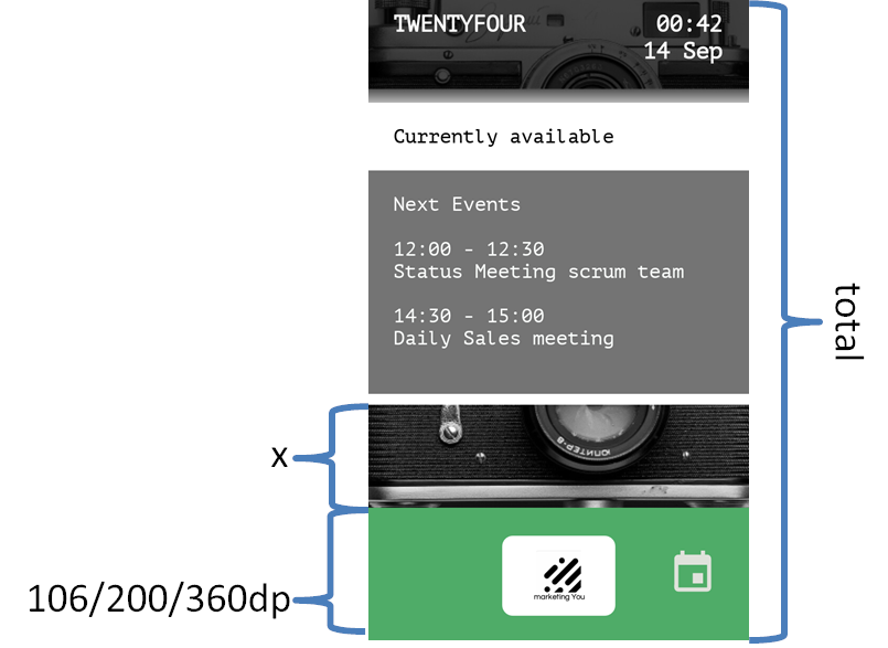
- This area will be covered by the red status bar (unless you customize the transparency):
-
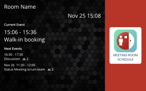
Vertically align the logo to ensure it is centred within the designated space
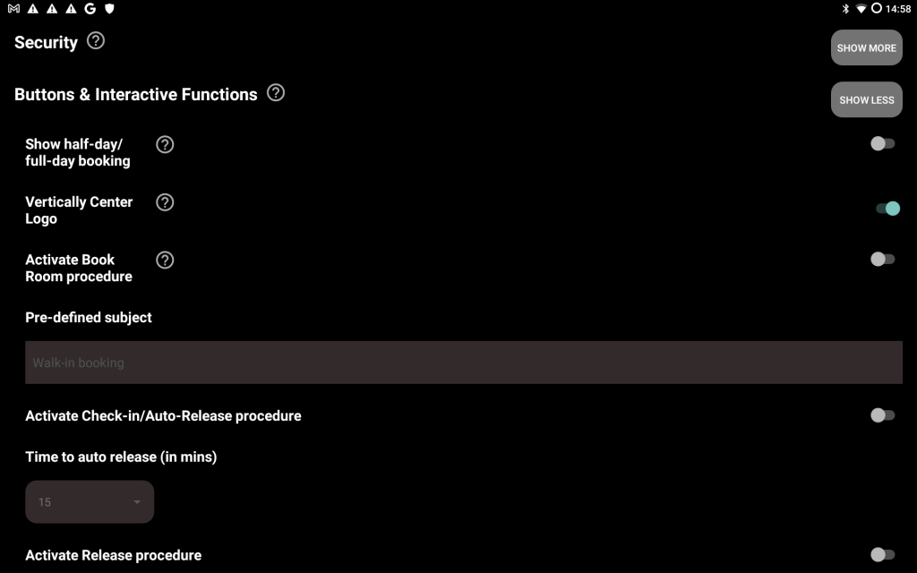
- Navigate to Admin Settings:
Locate the Buttons & Interactive Functions section and click on Show More.
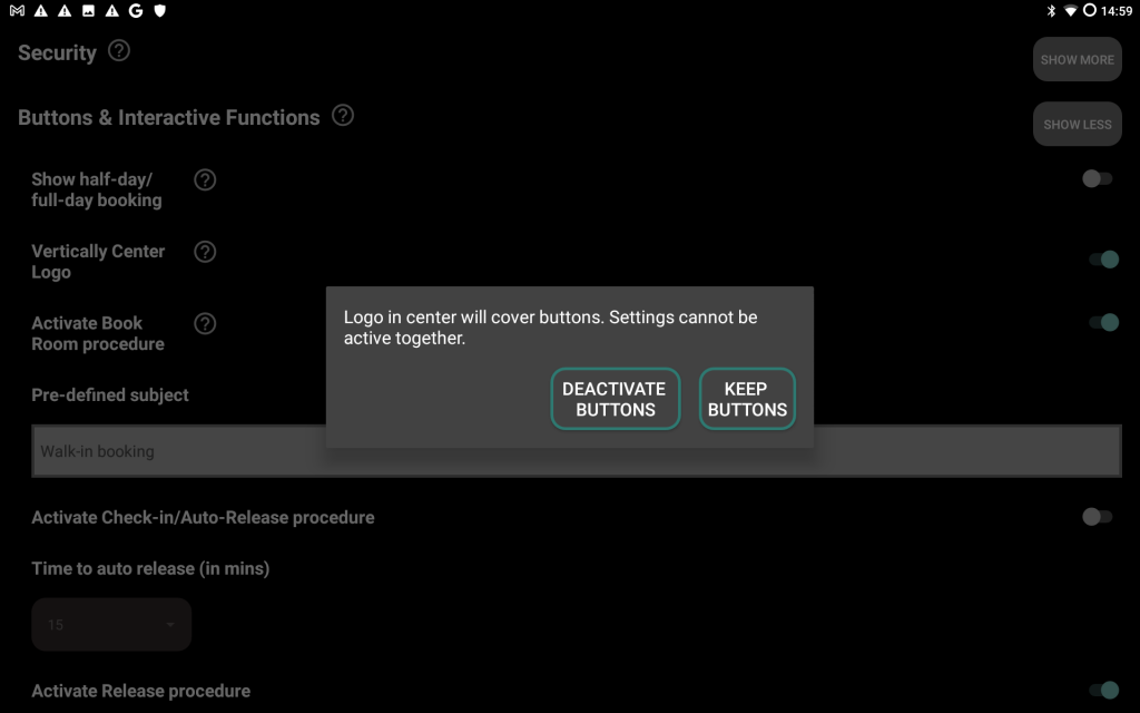
- Enable Vertical Centering:
Toggle the Vertically Center Logo switch. Please note that enabling this option will deactivate the interactive buttons and is only effective in landscape mode.
- Return to the Main Screen:
Go back to the main screen to apply the changes.

Do’s and Don‘ts
-
-
- Please note that the following examples show bad examples.
- Don’t use green and red for current zone and background. Irritates user with status and might even look more ugly if bar turns to a darker green.
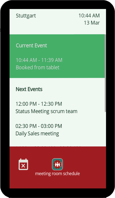
- Don’t use different fonts. This example uses 2 different font families and a variation with italics, which looks messy. Especially a combination of fonts with and without serifs are perceived as ugly.
- Don’t use many different font sizes. This example uses 3 different sizes (Top header, Current/Next event header, and Current/Next event data), which looks messy.
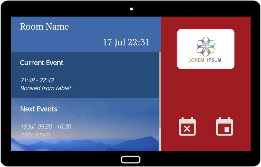
- Don’t use background picture with strong contrast. Background gives too much distraction. In the example, next events are harder to read due to strong black/white contrast. Consider appying a dark color with transparency like in the top header and current event section.
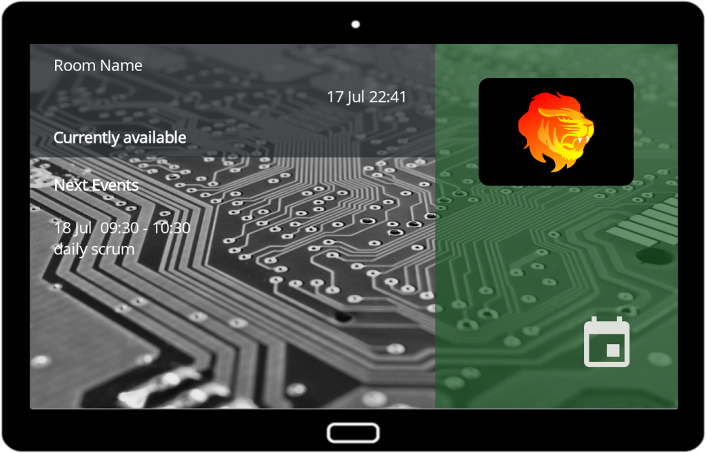
- Avoid overlap with background picture. Check date&time and the second next event with long subject. Readability suffers big time.
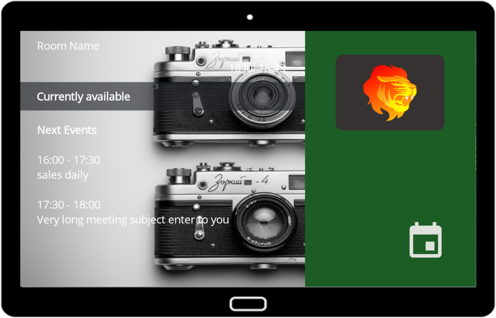
- Avoid stretched background picture. In the example, the background picture is distorted. The background picture is much narrower than the screen width of the device in landscape. This is even more problematic if it includes your company logo. Check your resolution and size calculation.
- The strong contrast of the background picture is another problem here.
- Also avoid too little contrast. Avoid „agressive“ colors. Greys and blues are safer.
-
